Extending a transactional communication system with push notifications
End-to-end
Enterprise UX

Company
Coolblue BV
Stakeholders
Customer Journey Specialists
Marketing Specialist
Status
Completed
Duration
5 months
Context.
Hailey is an internal Coolblue application used by customer journey specialists to manage transactional customer communications across multiple journeys. It was introduced to reduce reliance on development teams, enabling non-technical users to create and maintain email communications more efficiently.
As ownership shifted from developers to customer journey and marketing specialists, Hailey’s developer-centric interaction model did not scale well. This increased cognitive load and introduced a higher risk of errors during everyday tasks.
Key constraints
- Legacy application
- Developer centric interaction model
- Limited scope for structural changes
Enabling safe use of high risk communication channel for non-technical users
The introduction of push notifications amplified these challenges. Push notifications are highly constrained, time-sensitive, and irreversible once sent, making mistakes costly. The challenge was to extend Hailey with push notifications while ensuring non-technical users could create and send messages safely and confidently alongside existing email workflows. Broader usability improvements to the underlying system were intentionally out of scope to ensure timely delivery and contained operational risk.
Discovery.
Defining content guidelines
To establish clear guardrails, I collaborated with a customer journey content specialist to define content guidelines for push notifications. These guidelines set explicit boundaries for what users could and could not do, reducing ambiguity during editing.
- Title limited to 25 characters
- Message length between 80 and 119 characters
- Emoji support
- Compatibility with both iOS and Android
These constraints informed the interaction model and enabled early validation and error prevention.
Learning from existing editors
To align with familiar patterns, I reviewed established push notification editors to understand how other tools balance flexibility and control.
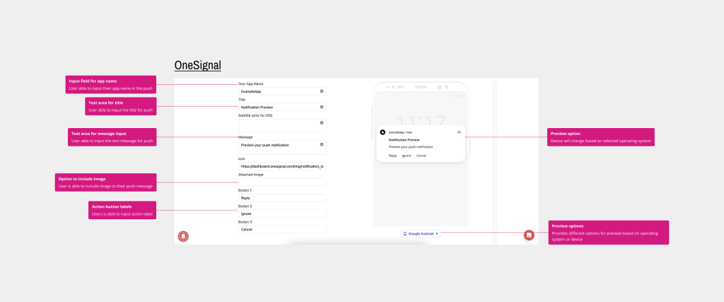
Observed patterns:
- Device or OS-based previews are commonly used
- Editing is limited to a small set of fields:
- Title
- Message
- Optional image
- URL
These insights helped define a minimal, focused set of editable parameters for Hailey.
Technical constraints
Before exploring solutions, I aligned with development and the product owner on scope. Due to known usability challenges in the existing interface, we agreed to reuse the current structural setup for message creation and address broader usability issues separately.
Out of scope:
- Create new template flow
- Improve usability of template editor
While not ideal, this tradeoff allowed the team to deliver push notifications within the allocated timeline while containing technical and operational risk.
Design.
Translating insights into requirements
Based on research and alignment, the initial design requirements were defined:
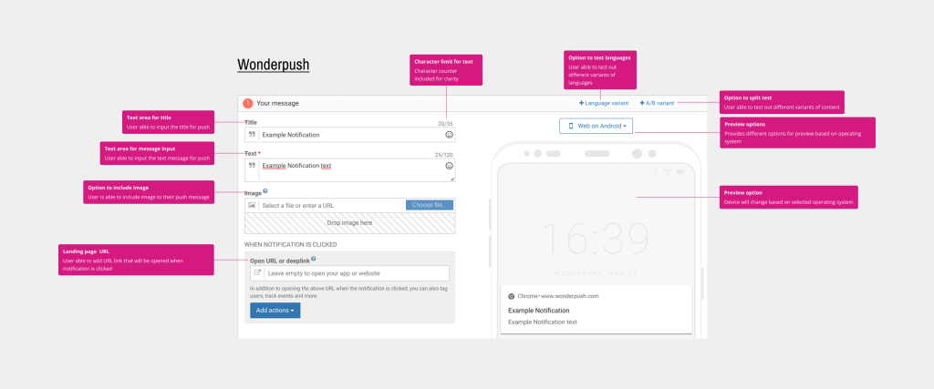
- Device-based preview support
- Limited editable fields (Title, Message, URL)
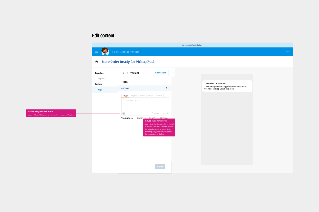
- Character counters for title and message
- Reuse of the existing content editing structure
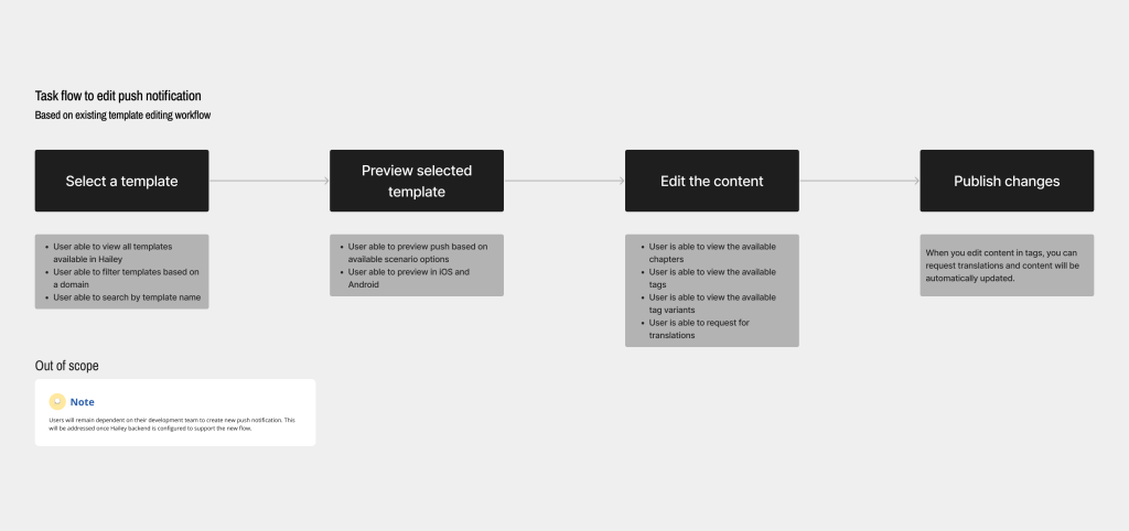
Designing the interaction flow
Given the constraints, clarity of process was critical. I mapped a task-focused flow that highlighted moments requiring user validation to ensure comprehension before sending a message.
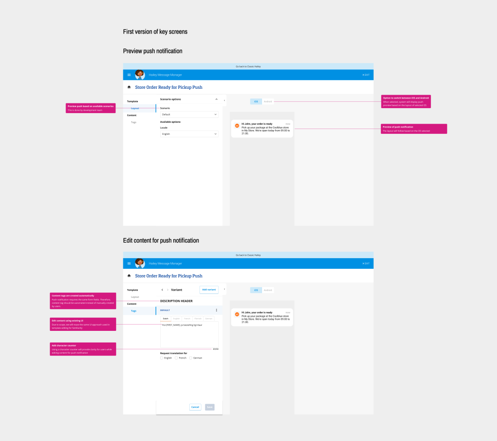
Design proposal, validation and iteration
I designed high-fidelity mock-ups to closely reflect the existing interface and minimise cognitive overhead during feedback sessions. This helped stakeholders focus on interaction and clarity rather than visual differences.
The design went through multiple rounds of feedback with customer journey specialists and internal development reviews, resulting in two major iterations. A key part of my role was facilitating discussions where user needs challenged existing system behaviour, and helping the team balance usability improvements with technical feasibility.
Key decisions informed by feedback:
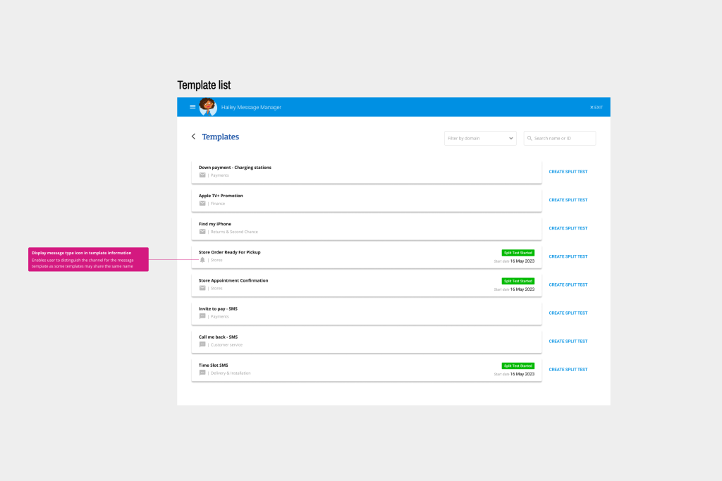
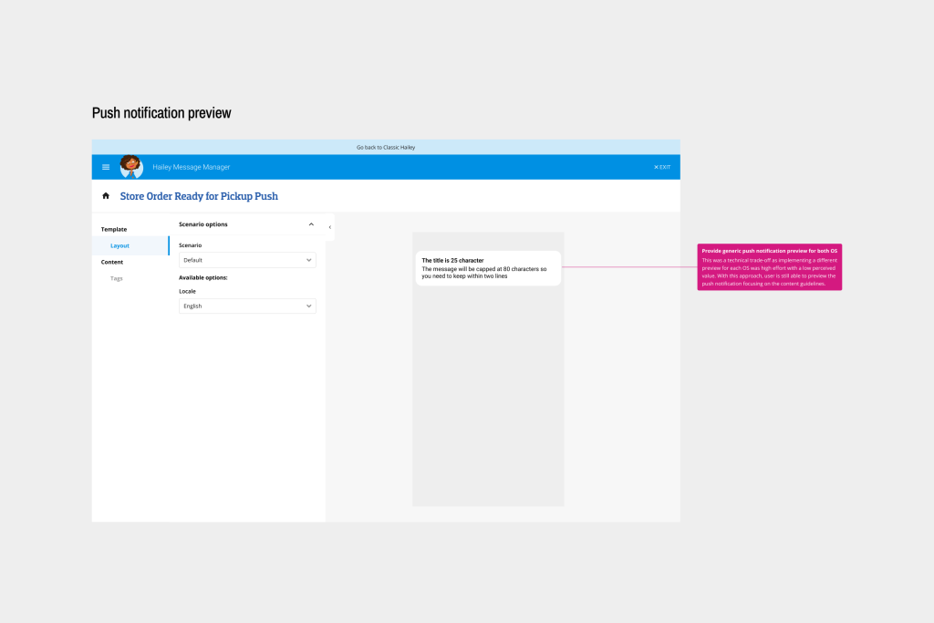
- Added message-type icons in the overview to help users distinguish between communication channels
- Introduced a generic preview that works across devices
- Implemented automatic content truncation based on defined guidelines
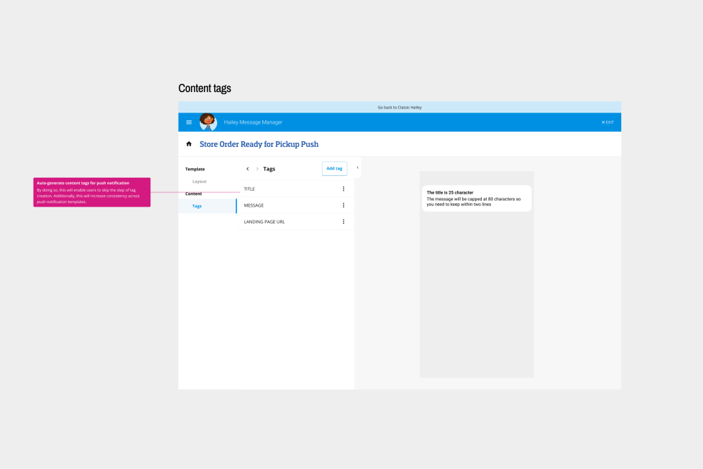
- Auto-generated content tags for push notifications to streamline workflows
- Retained chapter-based workflow to avoid significant scope expansion
- Included emoji support within defined constraints
Outcome
Final design
The final solution enabled customer journey specialists to create and send push notifications within clear guardrails, reducing reliance on development teams and lowering the risk of costly errors. By extending Hailey’s existing model rather than rebuilding it, the solution balanced usability improvements with development constraints.
Monitoring and feedback
Due to the small user base and the absence of built-in usage tracking, quantitative monitoring was limited. Instead, a qualitative feedback loop was established by checking in with users approximately three months after implementation. This allowed sufficient time for adoption and provided insights into real-world usage, confidence levels and areas of friction.
Next steps
Implementing push notifications surfaced broader usability risks that could affect long-term adoption of Hailey. To address this, the following next steps were identified with a focus on improving clarity and reducing friction for non-technical users:
- Provide lightweight documentation and in-context guidance to support correct feature usage
- Refine validation and feedback based on recurring user questions or observed mistakes
- Revisit broader usability improvements once structural constraints can be addressed
These steps aim to improve adoption without introducing additional complexity or dependency on development teams.
Key takeaways